


A distinctive lifestyle brand that brings people together.
The challenge
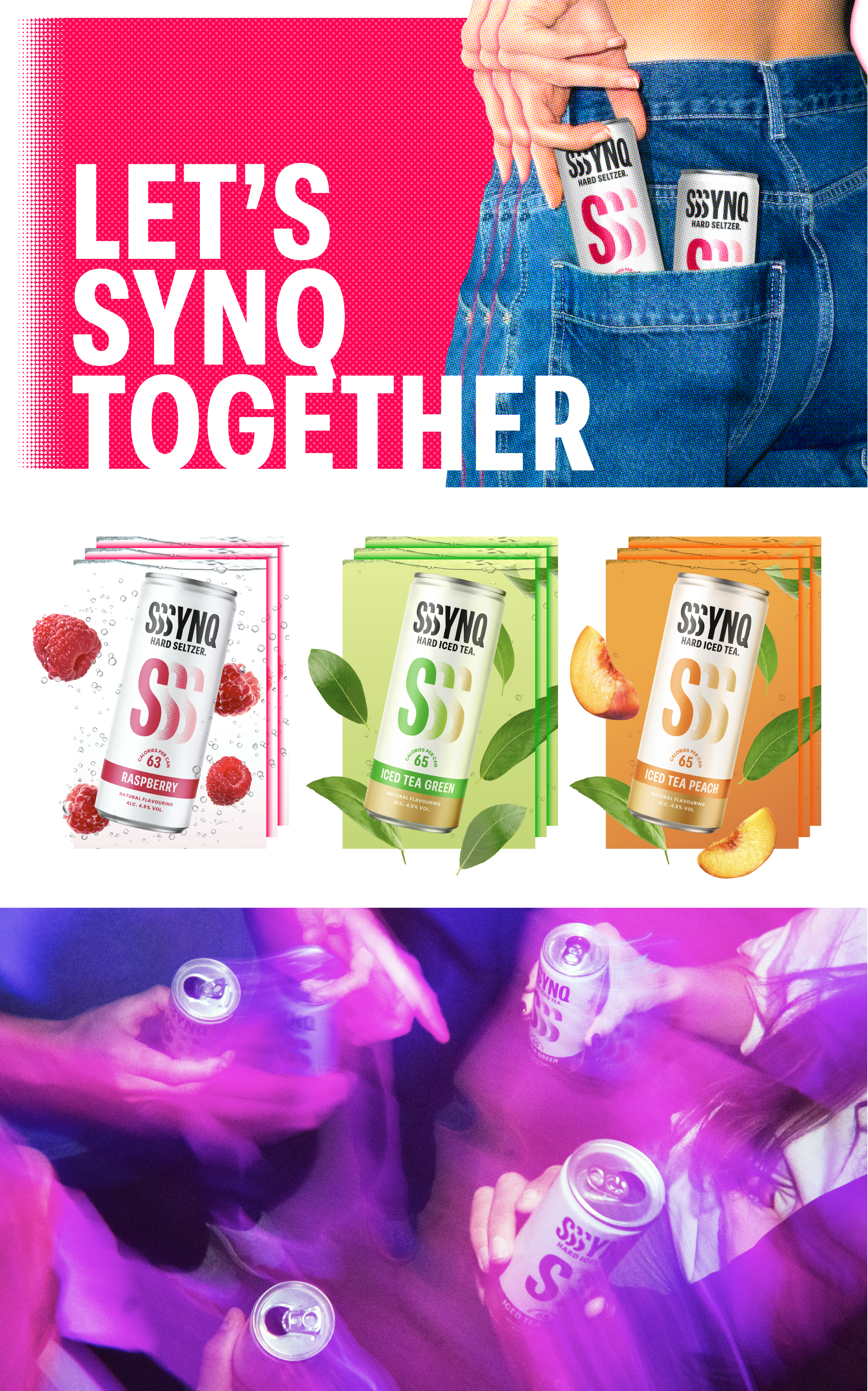
Gen Z drinks differently. Health considerations, the desire for lower-calorie alternatives and a changing nightlife culture are shifting traditional drinking habits towards new alternatives: mixed drinks, premixes and hard seltzers. Royal Swinkels is responding to this growing demand by bringing a hard seltzer concept to market. They asked Brum to develop the brand from the ground up, from naming and visual identity to packaging design. A brand that speaks the right language from the very first glance. One that instantly grabs your attention and makes you want to be seen with it.
The solution
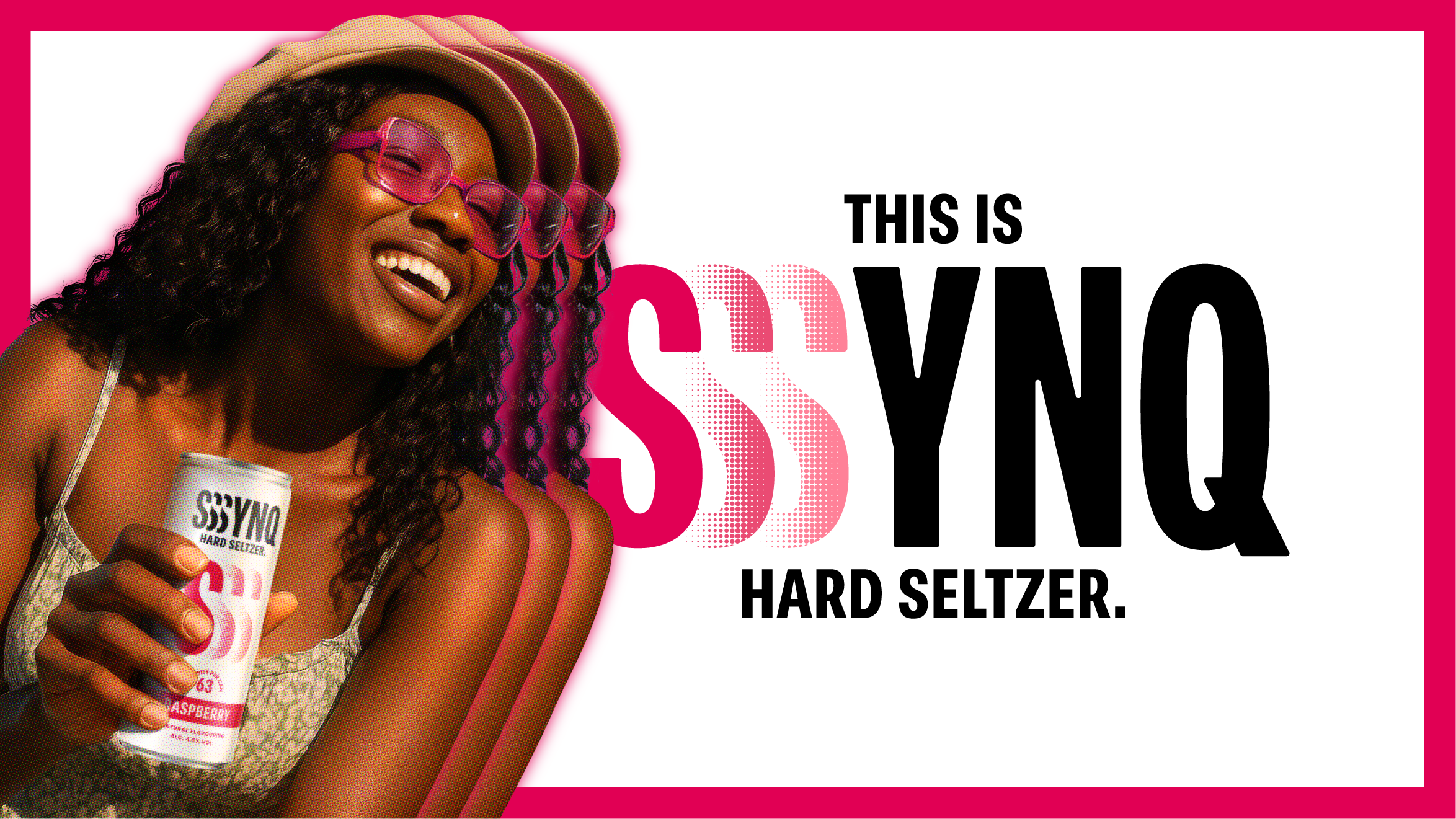
The euphoric, collective feeling of being at a festival or party inspired both the brand name and the visual identity. ‘SYNQ’ represents the shared experience of being in sync: hearing the rhythm of the music, dancing, enjoying the moment. ‘Move as one’ naturally became SYNQ’s payoff. The visual codes of hard seltzers are clearly defined, so for a new brand like SYNQ, staying within these familiar codes is important for recognition. At the same time, SYNQ has a face and a story of its own. The use of white space and a minimalist design create familiarity, while the bold ‘S’ symbol, oversized typography and halftone gradients spark interest.
The result
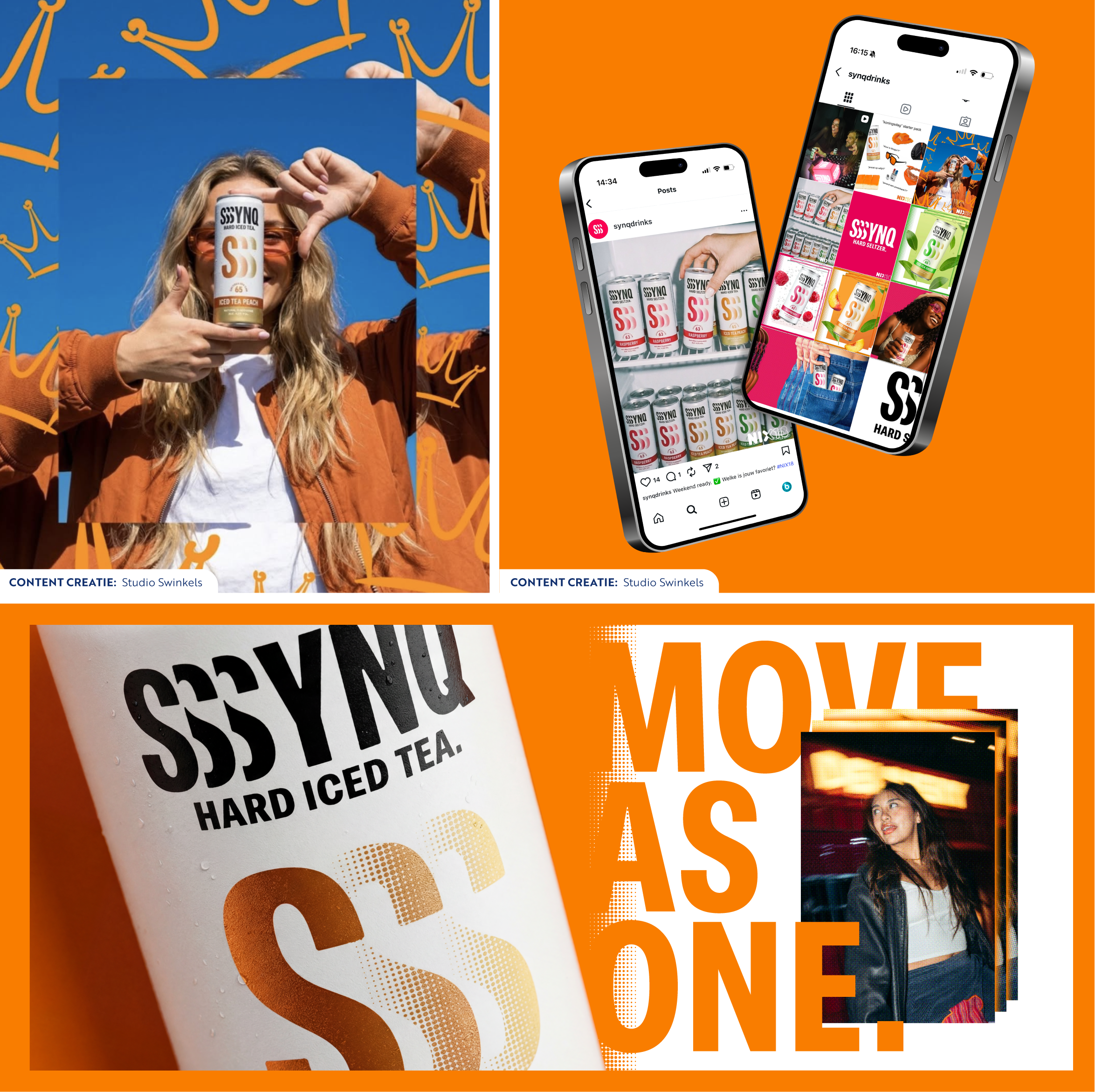
For SYNQ, we delivered a complete brand package. From the name to the logo, from packaging to a strong retail presentation, and from distinctive brand imagery to even narrowcasting videos. By developing everything under one roof, SYNQ gained the consistent, recognisable brand power it deserves. Both internally and externally, the SYNQ brand continues to evolve, ready to shine across festival grounds this summer!
The team
Strategy: Lisa van Diemeren
Design: Lisa van Diemeren, Sanne de Wit
Artwork: Nancy Prins
Narrowcasting video: Lisa van Diemeren, Sanne de Wit
Account management: Dagmar Schoonhoven
Social content: Studio Swinkels