The world could use a bit more love. Love for the people who provide us with great ingredients. Love and attention for good nutrition. And we were able to make some love (pun intended).
The assignment
The Organic Flavour Company needed a new tea brand that represents their values. We got to developed the brand name, brand identity and packaging design. It had to become an honest brand, so striking and desirable, that it would establish a revolution in the organic tea market. How we did that? We connected the consumer to the dreams of the brand.
The questions
There are a lot of organic tea brands, but none as honest as this new brand. That’s a bold thing to say, but it’s true! So how do we depict the superlative of organic and honesty? How can the brand stand out on the shelve? What brand name, strategy and design can create the perfect distinction to become category leader?
A clear promise
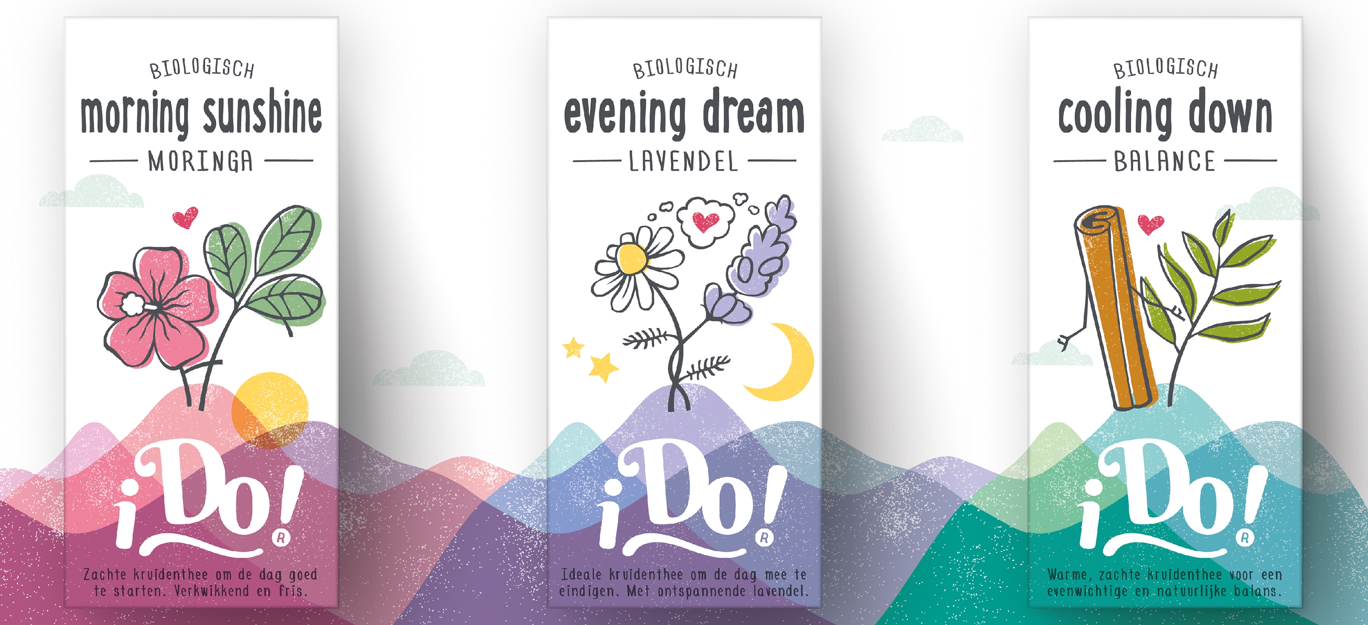
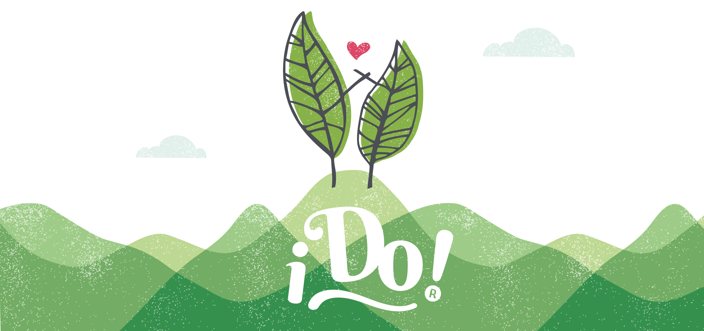
Caring for the planet and equal opportunities for everyone, and therefore a healthy earth, happy people, is a clear promise. We created the brand name i Do! as the positive way to almost literally connect the consumer to the ideals of the brand: the love of tea, the environment, the people and the perfect marriage of the ingredients.
The design
The pure ingredients are the heroes of the pack. They subtly fall in love with each other because of their beautiful match. They are illustrated in a naive way to express the sincerity of the product and brand. The typography matches the illustration style so it is fully integrated.
“Do you care about our planet and equal opportunities for everyone?
And, therefore, a healthy earth, happy people? - I Do!”
Eco materials
The materials have the least impact on the environment as possible. The FSC virgin paper is unbleached and without ink residues. The tea bag and the wrapper are both biodegradable. Even the string is made of organic cotton!
A powerful landscape on the shelf
The design is mainly white to distinct it from the particoloured and dark tea shelves. White also gives the virgin expression of innocence. The ingredients stand on top of the hills, which provide the colour coding of 14 different flavours. When the boxes stand together on the shelf, a colourful landscape creates a powerful impact.
You really want to collect them all, put them on your kitchen counter and show the world your love.
Yes you do!