The one and only Topking brand - known for the iconic 'Vlammetjes' - was in need of even more spice. Our experts got to work, and the result is... too hot to handle ;-)
The challenge
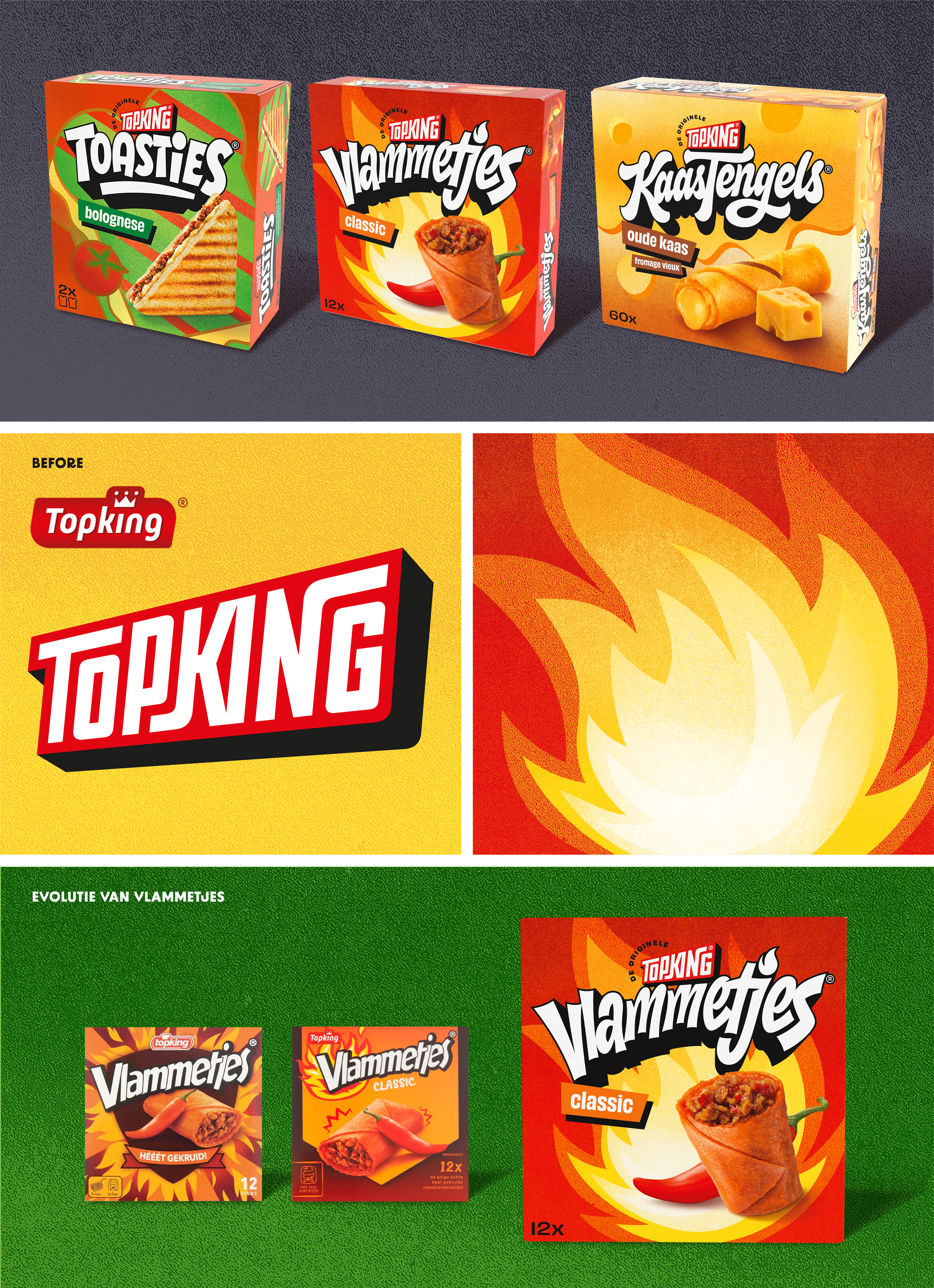
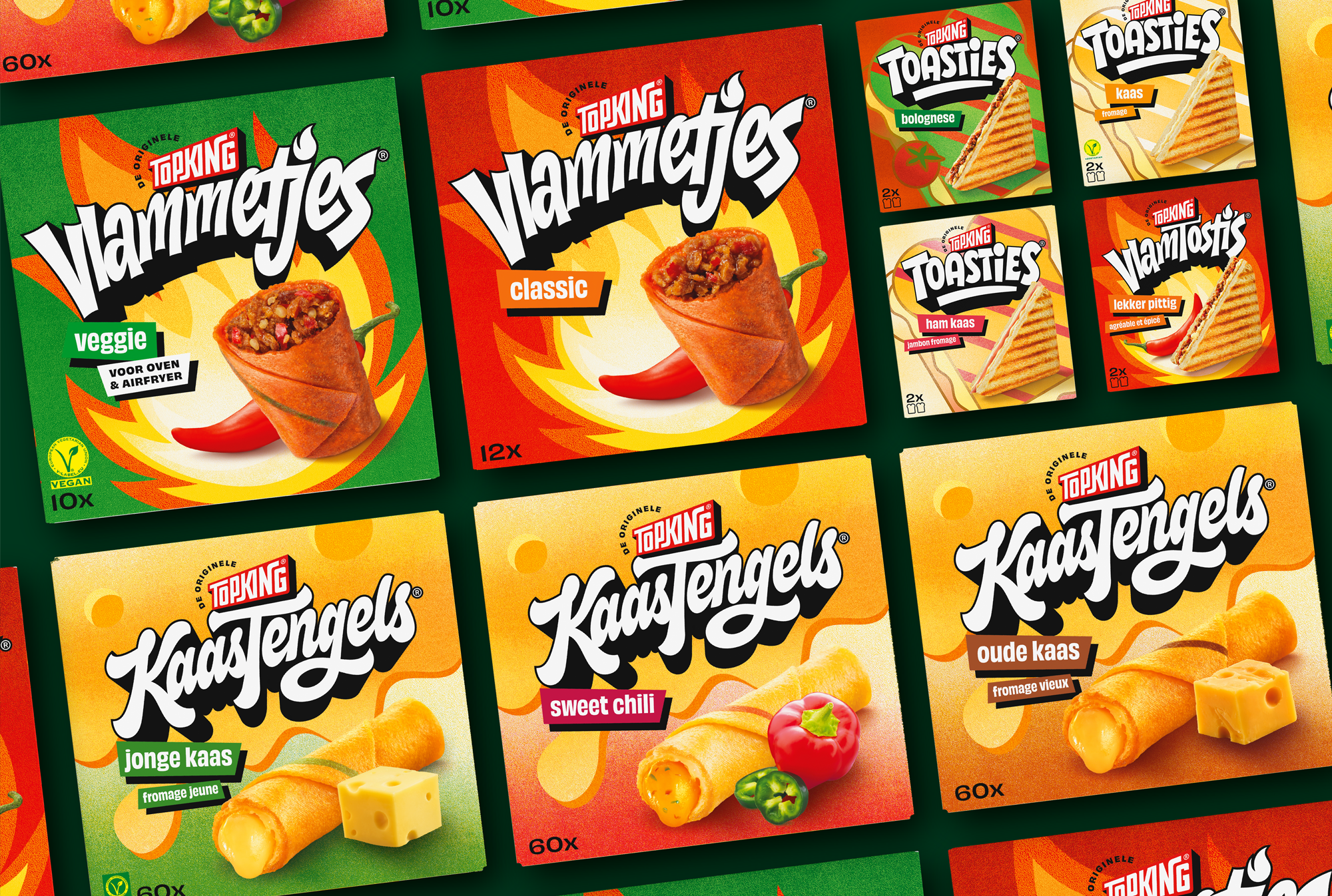
From Flame Paninis and Flame Toasties to Cheese Fingers and Mini Empanadas: the Topking brand, known for the iconic 'Vlammetjes,' is growing and expanding. 'Vlammetjes' and Cheese Fingers have become the big favorites, yet they were often seen merely as product categories rather than an A-brand. Even though competitors keep trying, the original Topking products are unmatched. It's time to sharpen the brand and its products' positioning and impact, aiming for unanimous consumer preference for Topking.
With an assortment as vast and diverse as Topking's, the balance between segmentation and uniformity is crucial. The Topking brand needs to act as a strong umbrella for all its sub-brands, each carrying its own distinct positioning.
The solution
The Rotterdam roots of Topking formed the foundation for a unique portfolio strategy, inspired by the urban streets, their flavors, and eating habits: for every Rotterdammer, these are slightly different, yet the city still connects everyone. This is precisely how Topking functions as a House of Brands, with its own unique residents: 'Vlammetjes,' 'KaasTengels,' and 'Toasties.'
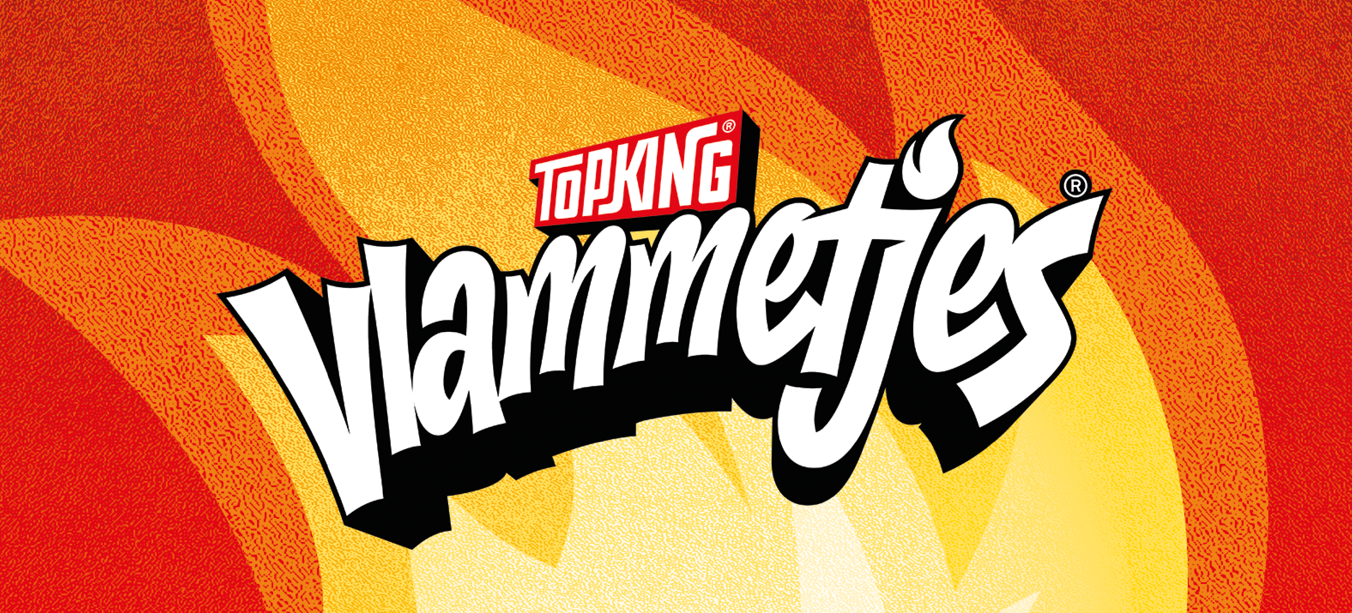
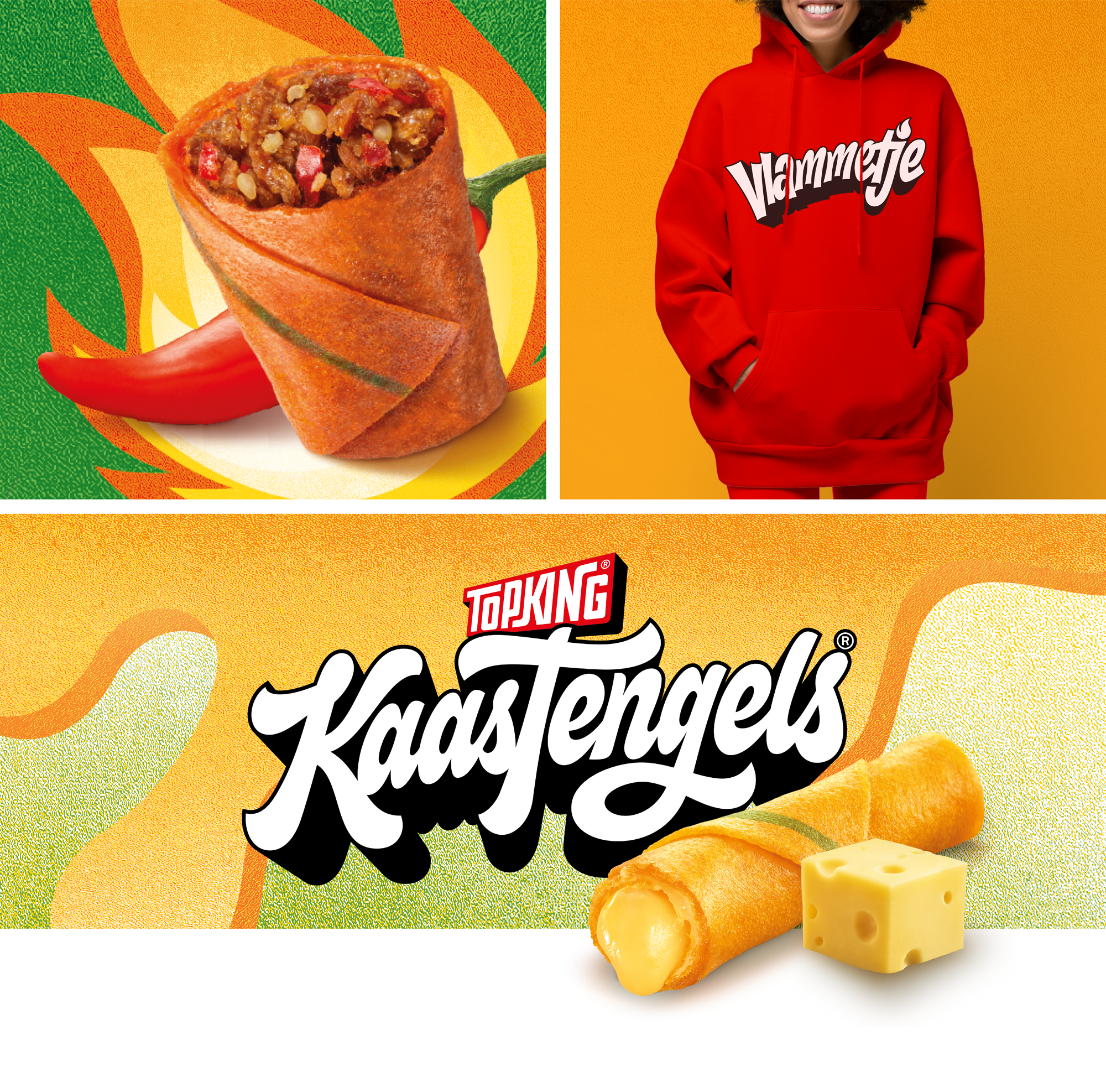
With its perspective 3D shapes, we crafted a nod to the city skylines in the new Topking logo. Returning to the graphic simplicity of the original logo: no frills or embellishments. Presented in the sturdy, recognizable Topking red.
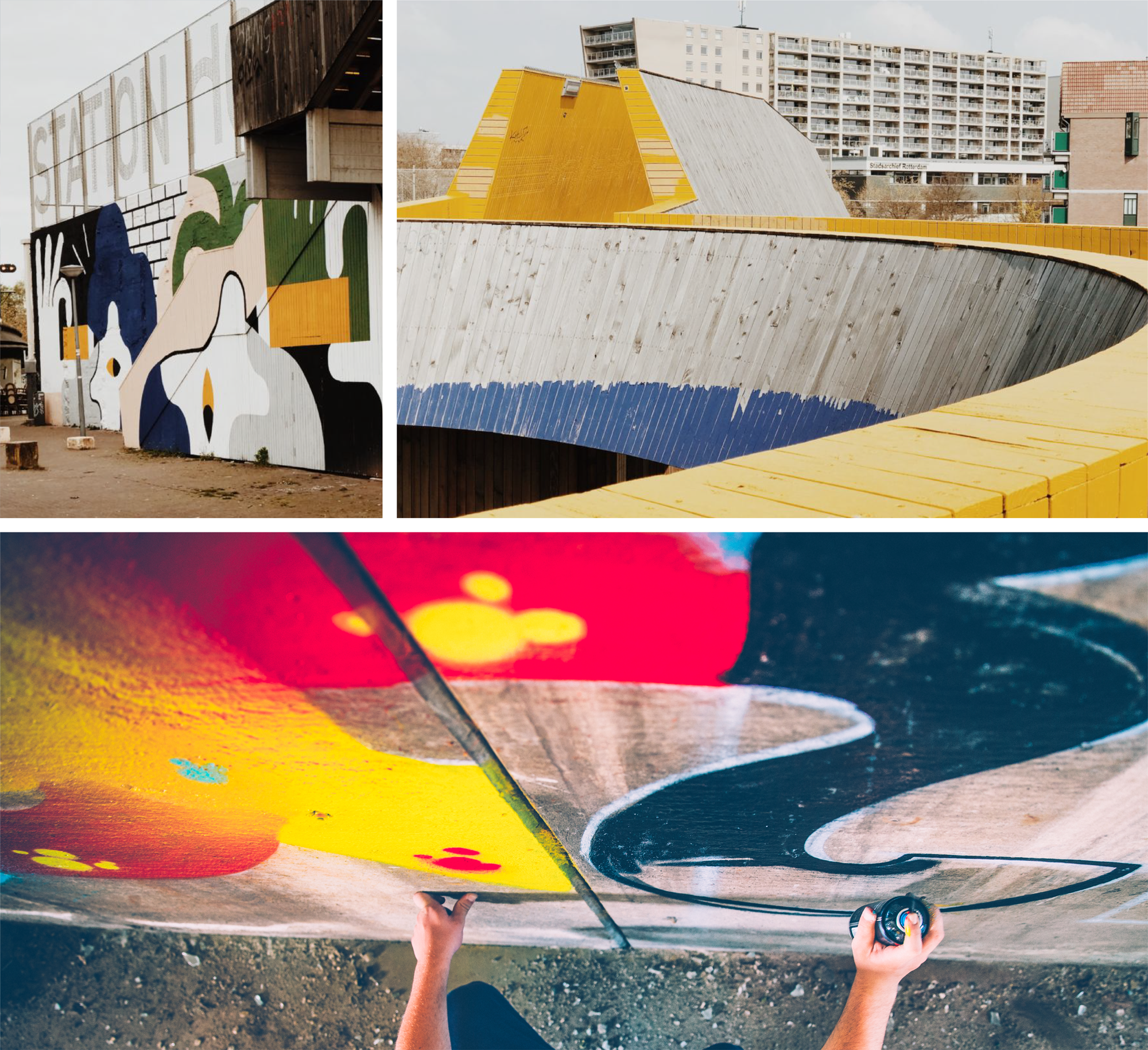
For the overarching visual identity of Topking, we marveled at everything visible in the big city: pasted posters, lightboxes, artistic murals, and graffiti tags. The sub-brands were given a black-and-white, graffiti-inspired wordmark, each with its own character, which visually still maintains a strong connection to the previous brand logos. On the packaging, one iconic visual element is placed centrally, like a cutout from the murals you encounter in the big city. Disruptive in its simplicity, finished with fine grain.
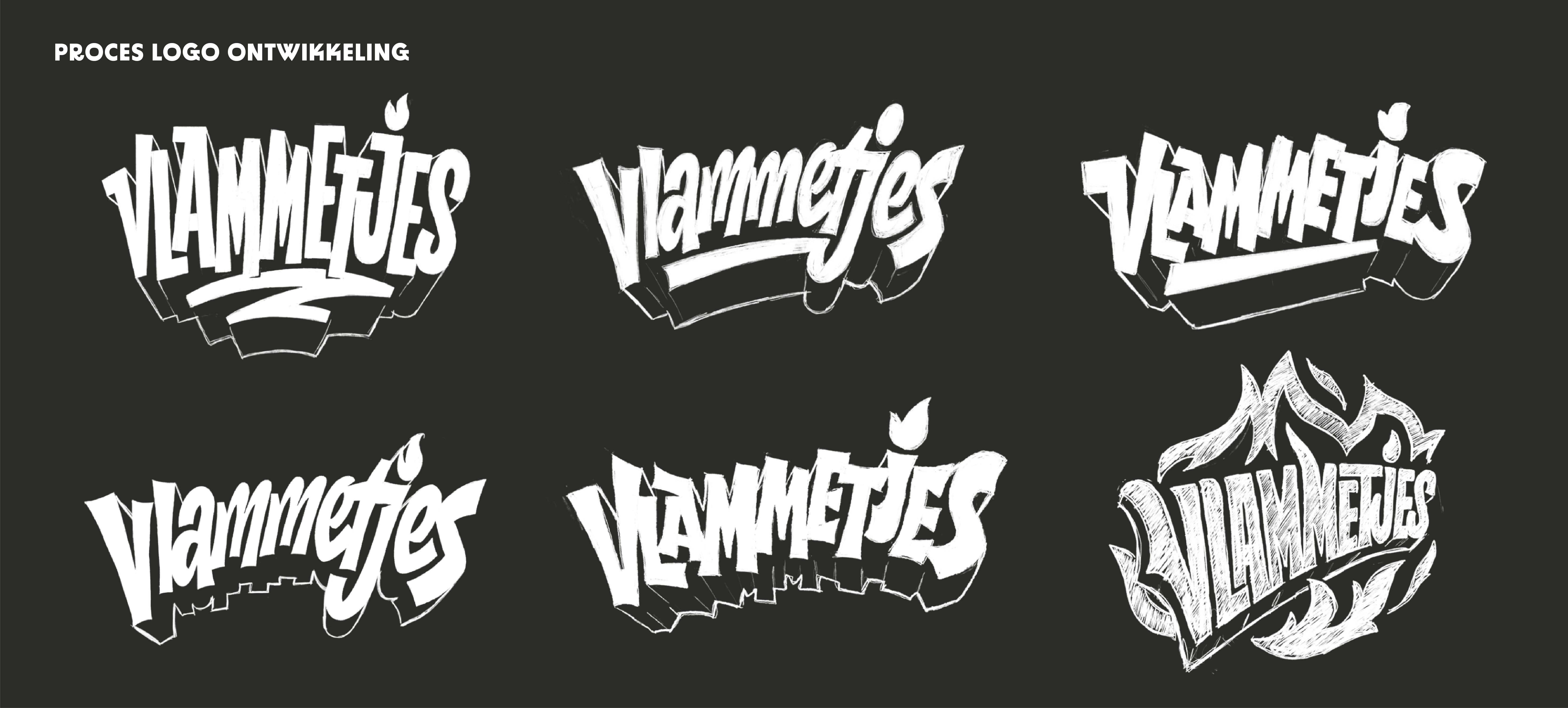
A hand made logo
For the development of the Topking logo and brand logos, we collaborated with typographer Thom Niessink. He elevated the execution of our concepts to a higher and unique aesthetic level! Curious about Thom's work? You can find it here: www.thomniessink.nl
The result
By now, about 90% of the Topking assortment has transitioned to the new identity. The visual impact of this redesign is tremendous: there's synergy among everything Topking creates and does. The framework and freedom of the new visual language also ensure that new product launches and marketing materials, both visually and strategically, can be developed in a smart and consistent manner. It's a design system we're proud of!
Het team
Design: Saskia Berting, Lisa van Diemeren
Artwork: Nancy Prins, Vijay Sardjoe
Project management: Anne van Eijk
Typografie en illustratie: Thom Niessink
Fotografie: Daan Verschuur
Beeldbewerking: Fred Rietveld
Foodstyling: Oliver Knight