Launching a new, relatively unknown product in the market: how do you stand out and ensure that buyers understand what it is? Put on your sunglasses because you can't miss the packaging of Wochi Mochi!
The challenge
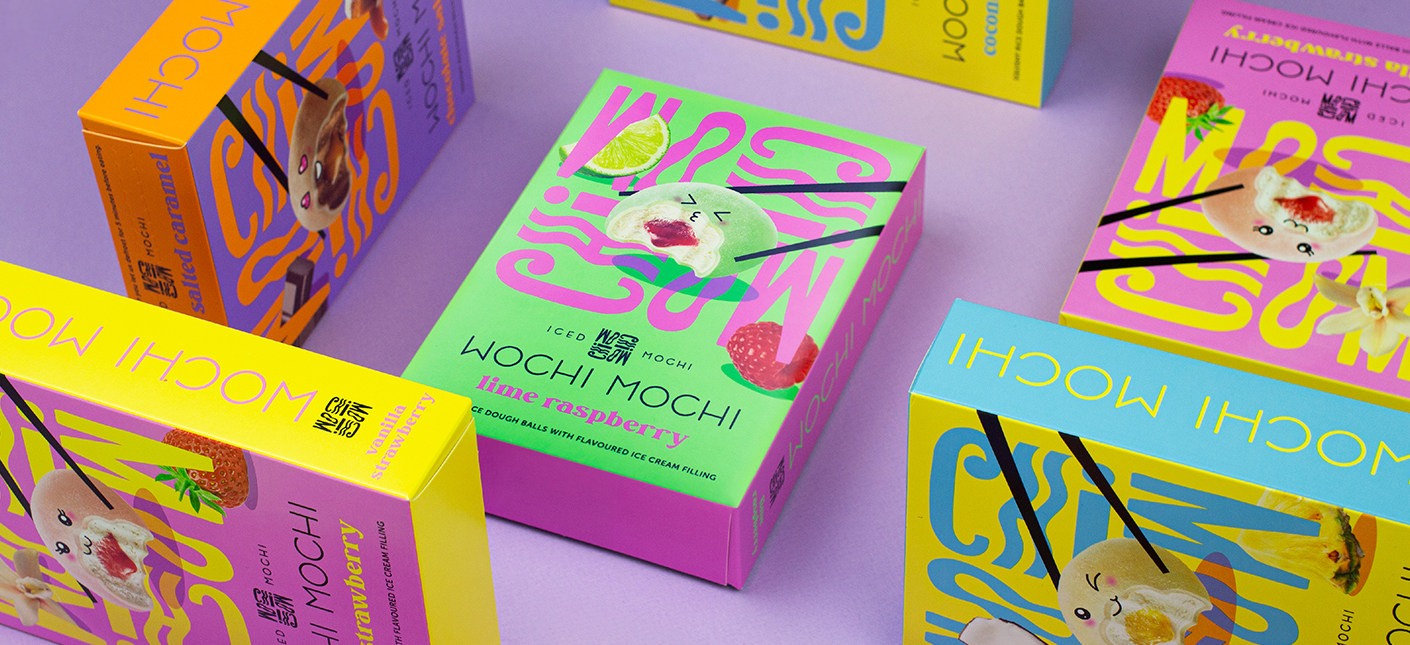
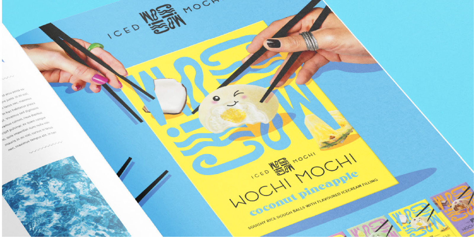
Welcome to the world of mochi: Japanese filled rice dough balls, in this case, with an ice cream core. A snack that's becoming increasingly popular in the Netherlands but remains relatively unknown to the general public. How do you market this? Our client took on this challenge and sought our help. The question? Develop visual branding with corresponding packaging for the Wochi Mochi brand. The requirements? Ensure that the buyer understands what it is and create eye-catching appeal in the ice cream section. Any limits? None at all. We're encouraged to unleash our creativity: every agency's dream!
Brummers, let's get to work! How do you stand out in one of the most colorful and crowded aisles? And how do you ensure that buyers quickly grasp what you're selling?
The solution: Kaomoji
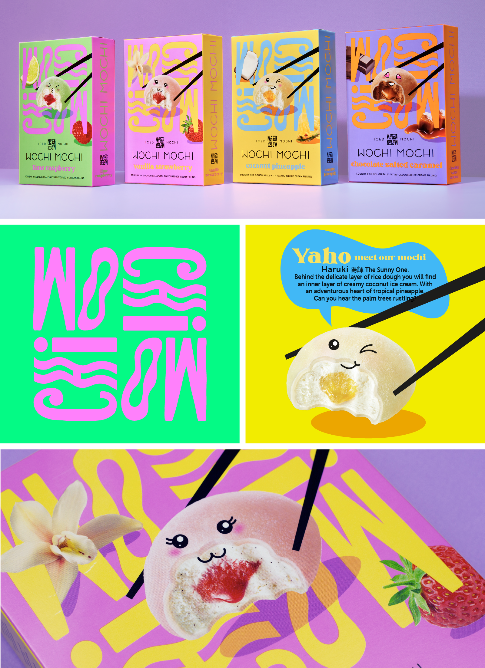
The solution we devised wasn't just a stunning design; we crafted a world. A world painted in vibrant colors inspired by the colorful Japanese street culture, combined with Kaomoji: Japanese emoticons, which number over 1000. Ultimately, four variations of ice cream mochi were born: Coconut Pineapple, Chocolate Salted Caramel, Vanilla Strawberry, and Lime Raspberry. During the packaging creation, we conducted a competitive analysis to assess how our design would stand out in the current aisle. Satisfied? Absolutely! It's a packaging you can't ignore.
These elements contribute to the dazzling visual branding:
- The mochi: Express how you feel! The mochi naturally reveal their inner selves through their transparent rice dough jackets. They make a statement and bring a smile to your face. Each has a different character, challenging the buyer to show themselves (more) and stand out. And let's be honest: they're incredibly adorable! Their bodies consist of photographed mochi, clearly displaying the product.
- Logo: You need to take a second look at this logo, and that's precisely what we want! Comprising various shapes and textures, available in different colors (from the Wochi Mochi color palette), and readable from multiple angles. The diverse, wobbly shapes represent the differences between mochi and people. A logo with a small statement.
- Vibrant colors: Unavoidable and one of the key elements of Wochi Mochi's brand identity. A palette of six striking colors, also used to showcase the various mochi flavors. Additionally, there's only one rule: big contrasts! This gives the brand a bold, fun look that instantly brings joy.
- Branding & Merchandise: For Wochi Mochi, we developed an extensive brand book. From social media to photography, typography to tone of voice, everything is detailed in this brand book. It was a blast to create! Additionally, we designed flashy merchandise that we can already envision ourselves wearing. A hoodie for every Brummer, please!
The result
The packaging of Wochi Mochi is now on shelves at AH (Albert Heijn) among others. The packaging design was in the running for a Pentaward. Guess what? We won the NLPA Runner-up Award. More about this below the photo.
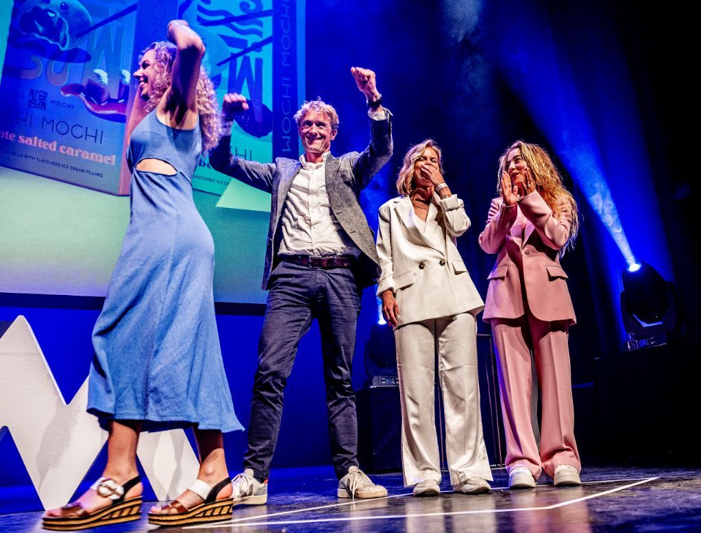
An award-winning design
Our design for Wochi Mochi has won the NLPA Runner-up Award in the Food Shelf-Stable category. Curious about the jury's comments? Here they are:
"This packaging brings joy. It's optimistic, cheerful, creatively executed, and attracts attention with its colors. The hierarchy in the names adds an element of sophistication, and the letters can be read in multiple ways. The font is interesting, and the colors and logo are cool. The jury also positively acknowledges the use of 2 monomaterials and white plastic.
Moreover, there's a clear hierarchy between the brand, flavors, and explanations. The various flavors are well explained and consistently presented. The combination of photography and illustration is enjoyable and robust. The photos are good, and it looks delicious. The typography is carefully crafted and easily legible. The design gains depth and comes to life through the use of shadows. There's a lot of love and attention evident in this packaging. Well done.
The submission is a runner-up because it appears too busy. The jury regrets the lack of more decisive choices. It's too much in terms of design and information. This decision makes this submission a runner-up and not a winner.
Het team
Design: Lisa van Diemeren, Mirte Redan
Artwork: Erik Balke
Fotografie: Daan Verschuur
Beeldbewerking: Fred Rietveld