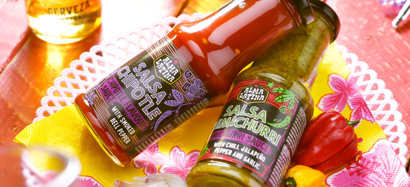
This is another project that's delightful to sink your teeth into. Quite literally and figuratively! Lidl tasked us with developing an entirely new brand, including its name and design, for a promotional week themed around South America. It involves a diverse range of South American products, from empanadas to pineapple juice, aimed at enticing and surprising the consumer. We named it Alma Latina: Latin Soul.
Brand new brand and design
How do you combine the vibrant essence of South America with the diversity of flavors and recipes from various countries into one distinctive brand? Additionally, we had to consider that the South American products will be on shelves in several countries at Lidl over the coming years. So, it needed to be distinctive and innovative yet universally recognizable for international rollout.
Harvest from the Tree of Life
That led us to the Tree of Life - the Arbol de la Vida - originating from the Peruvian Inca empire. It symbolizes the colorful life with all its diversity, including the delightful, authentic flavors that South America has to offer. The tree serves as a framework for Alma Latina; the distinctive characteristics of different countries find their place through illustrations. Recognizable and understandable for everyone.
Daring black
In the packaging design, we've opted for a black background combined with vibrant colors that are synonymous with South American culture. Since black isn't commonly found on the store shelves, it stands out nicely. Moreover, the photography seems to pop right off it! We've ensured the lighting exudes an ultimate summer vibe. The striped pattern in the background, resembling an authentic etching style inspired by the Nazca lines, along with a colored frame around the entire design, gives the products a distinctive, lively, and unique appearance.
Spanish flavor enhancers
Speaking of a unique identity, c’est le ton qui fait la musique. The communication from the products is adorned with prominent texts in Spanish. Coupled with the photography, it becomes a real flavor enhancer. After all, Croquetas de Pollo Massala or Jugo de Piña sounds a tad more appealing than Chicken Croquettes Masala and Pineapple Juice! We hope that this way, consumers will embark on a journey through the rich and diverse flavors of South America and embrace this new brand.
Het team
Artwork: Maaike Witzel
Project management: Marc Terlien
Fotografie: Studio_M