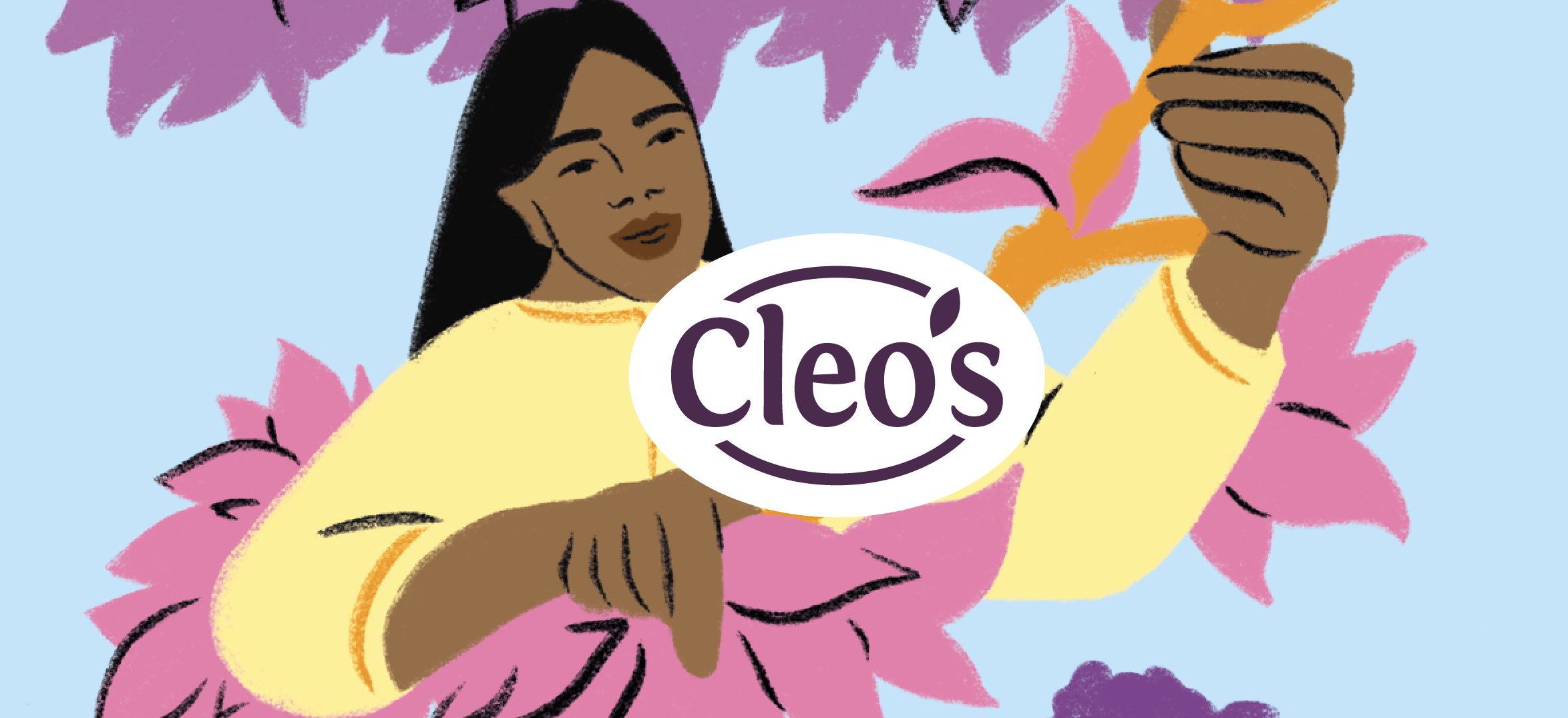
The tea brand Cleo's has a beautiful story to tell: a story that revolves around sustainability and equality. One that hasn't been visually communicated enough, especially on the packaging. It's time to change that!
The challenge
Cleo’s mission? Time for equality! Moving towards more equality in the tea and herb chain: ensuring everyone gets a fair price. Additionally, Cleo’s aims to raise awareness among tea drinkers so they can make more conscious purchasing choices. By setting this as the new standard, Cleo’s hopes to inspire other tea brands to follow suit, leading toward a sustainable, equitable world. Telling such a story visually in the challenging, crowded tea market is an art. It requires impact! In short: Cleo’s has a beautiful story, and it's up to Brum to bring it to life visually!
The solution: sharing = caring
The strategic foundation of the Cleo’s brand was incredibly strong. Collaborating with the Organic Flavour Company infused that strategy with a unique, inspiring character. This personality, combined with the product features, culminates in a human-centered, vibrant brand identity:
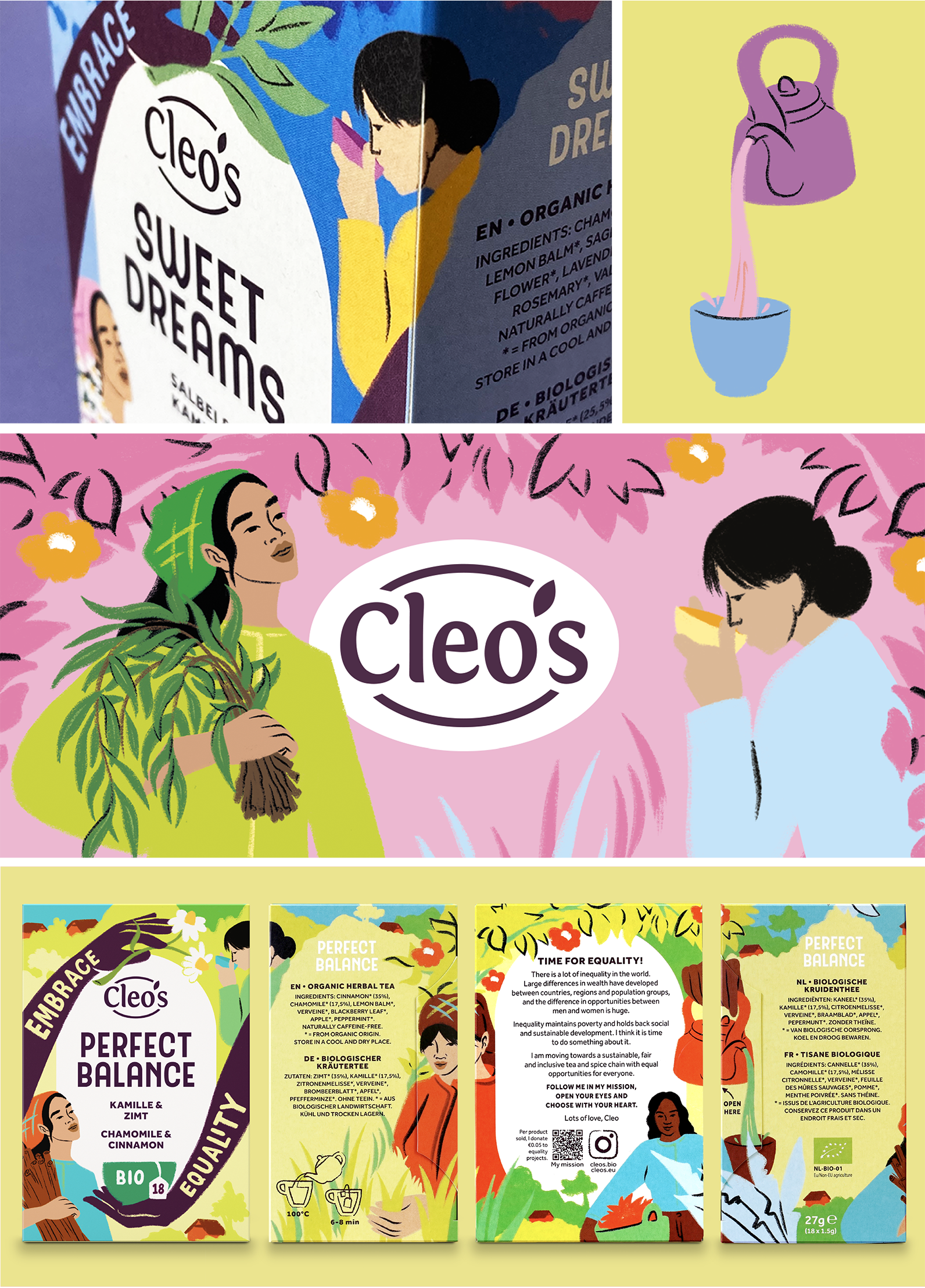
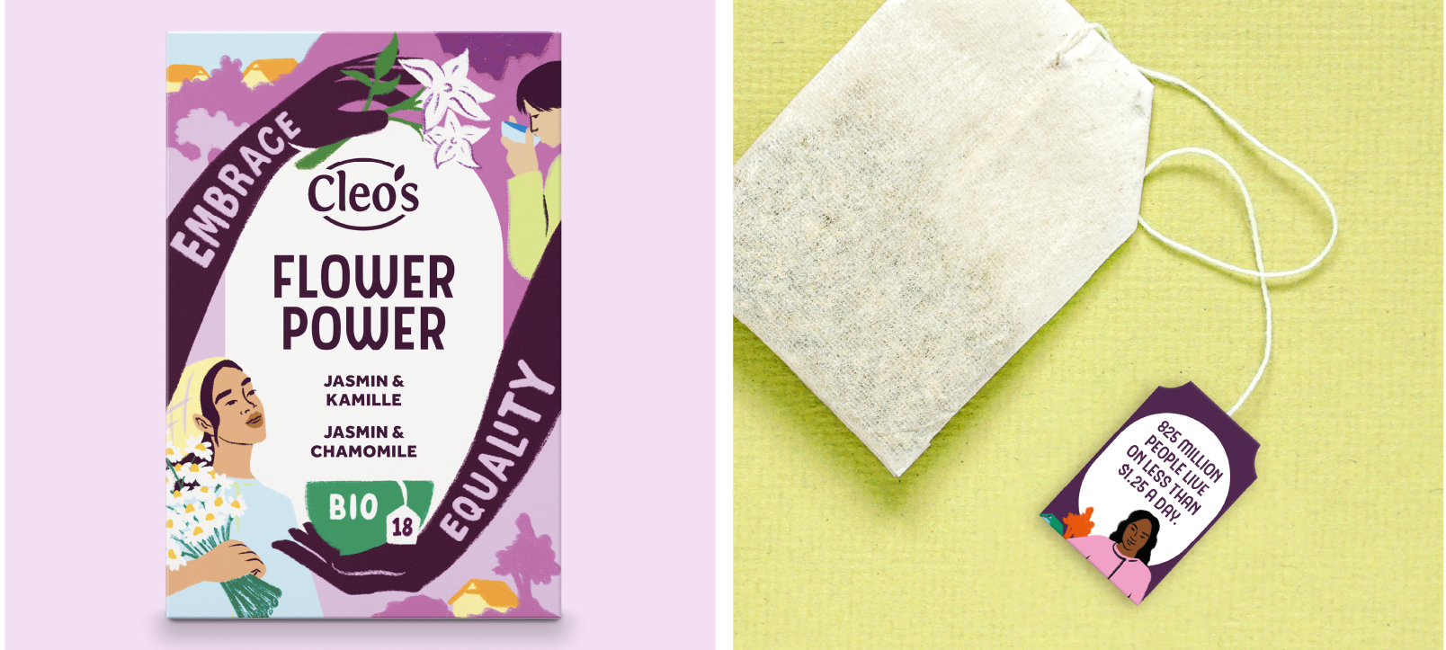
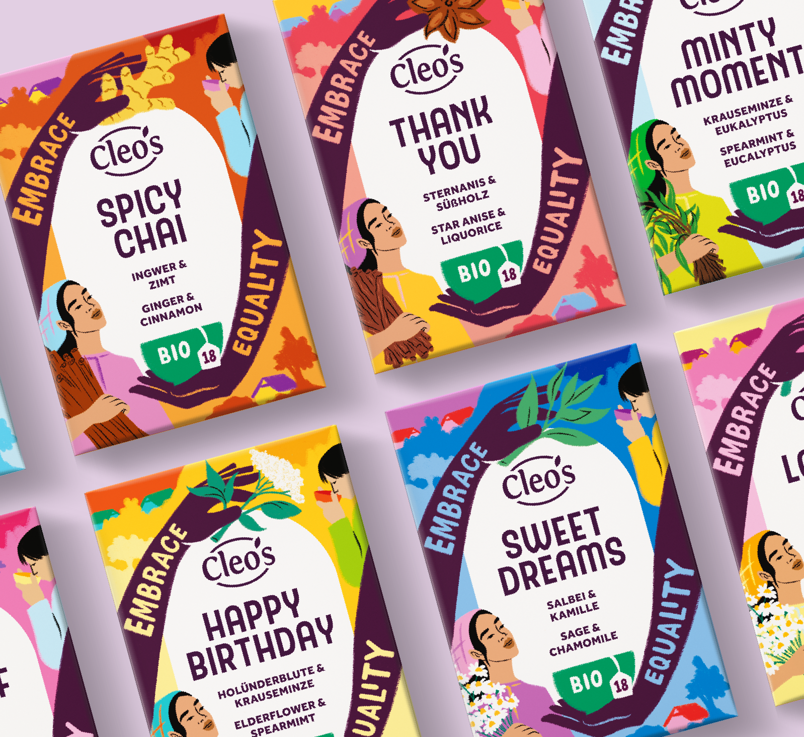
- Humanity and nature at the core: With many natural elements and iconic illustrations of female pickers, Cleo’s packaging puts emphasis on both humanity and nature. Placing such a human element in such a prominent role is groundbreaking for the tea aisle.
- Brand recognition and shelf impact: The arms on the packaging symbolize human connection and create a significant shelf impact through the contrast between the arms and the white center. Additionally, the visual continuation of the arms on the shelf creates a cohesive movement. And that grabs attention!
- Space for storytelling: The entire packaging breathes the story of Cleo’s, through illustrations and copy. One of the key sides of the packaging—the back—is wholly dedicated to storytelling.
- Optimal flavor experience: Flavor and ingredients take center stage! The hands and pickers on the facing side hold the ingredients: freshly and honestly picked for you!
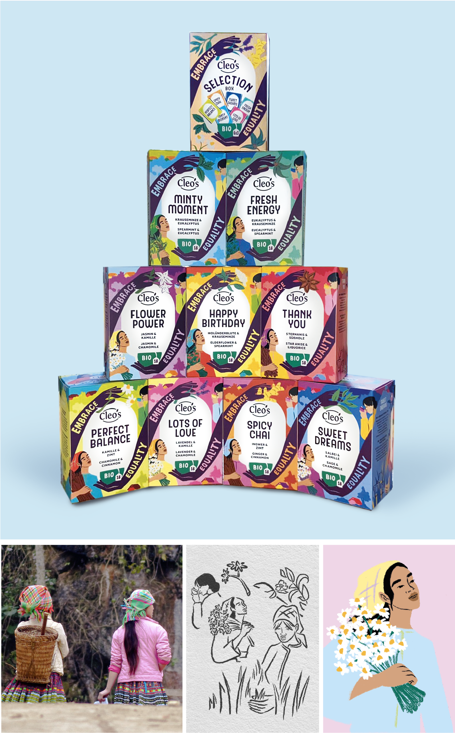
Illustrations
The beautiful illustrations on the packaging come from the perfect illustrator for this job: Sandy van Helden. Her manual, friendly signature was a perfect match for the Cleo’s brand. Thanks to her illustrations, the brand gets a face (quite literally!) or rather, multiple faces! To tell the story as accurately as possible visually, Sandy based the illustrations on actual imagery of the pickers provided by Cleo’s!
The result
You can't overlook Cleo’s packaging: the block formation thanks to the hands, the eclectic color palette, the color and shade contrasts, the human element… Just as with its mission, Cleo’s design is now setting the tone for its market with design. We hope that other tea brands will soon follow their example in sustainability and equality. On the way to a sustainable, equitable world. Time for change!
Het team
Design: Saskia Berting, Eva Verbeek
Project management: Anne van Eijk
Artwork: Erik Balke, Vijay Sardjoe
Illustratie: Sandy van Helden